Default Version
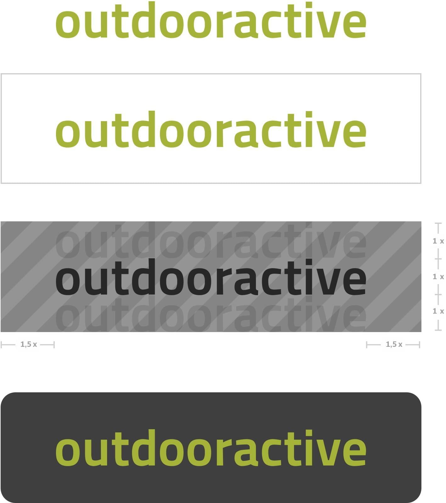
This is the default version of our logo.
This version shows the default logo, but with a transparent background, which is delimited by the gray border. This border represents the protective space around the logo, i.e. the minimum distance that must be maintained between the logo and all other elements.
The grey area here serves as a placeholder for the final background and represents the protective space around the logo. The logo does not display the grey area when applied.
Recommended standard version with #3f3f3f background (also available with #ffffff background)
Default Version – Usage
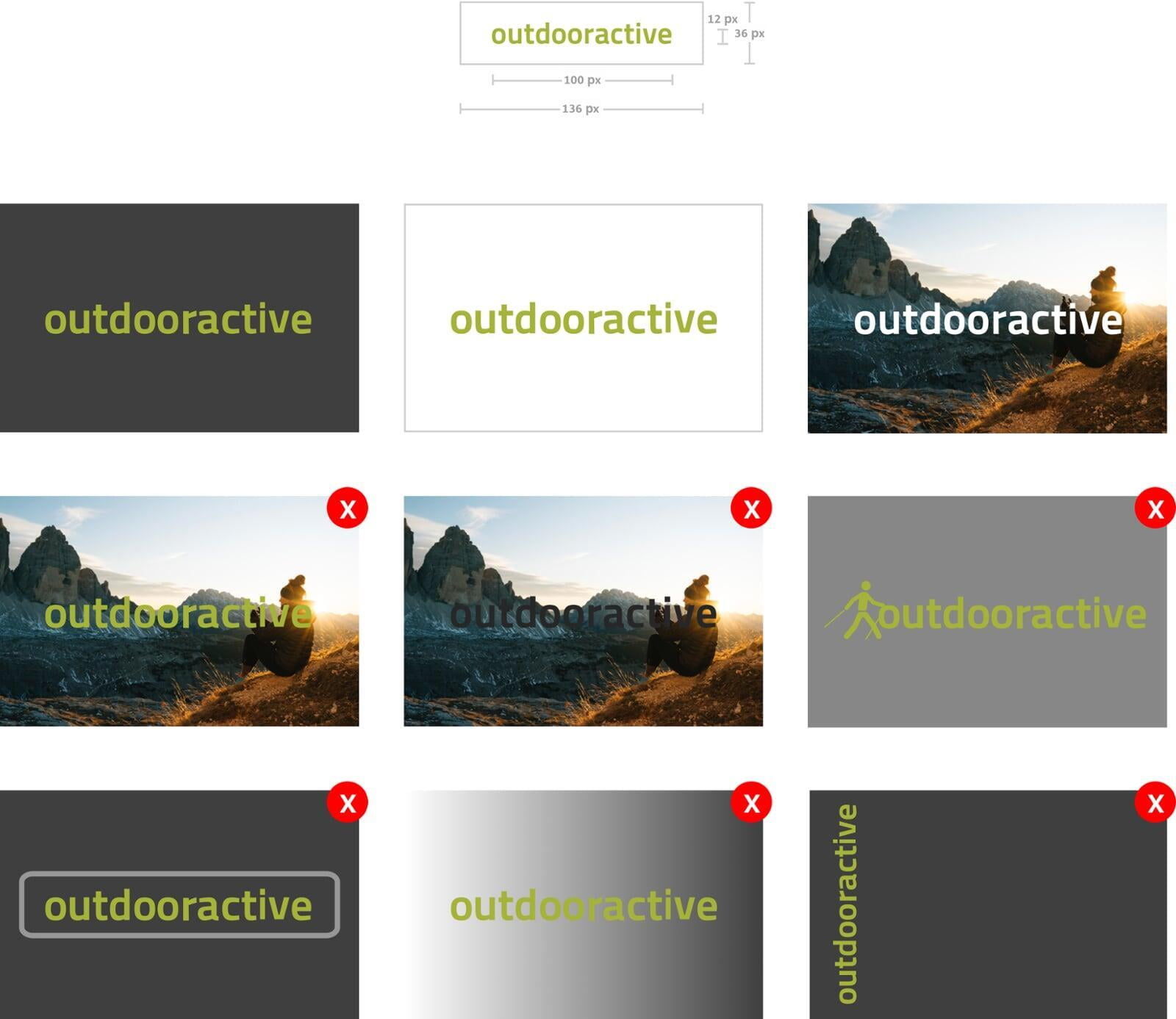
The default logo should be displayed up to 12px x 100px (approx. 3,2mm x 26,5mm) and the protective space maintained. If this is not possible, a 'marker' (see next section "Variations and Additions") should be used instead.
The logo on a dark background (no lighter than #3f3f3f) and on a white background (only #ffffff). Both white and black logos can be placed on images.
Never use the green logo on images if the contrast is insufficient to ensure clear branding. Always use the logo variant with the highest contrast. No combinations and no green on grey!
Do not use frames or borders. Use the logos with backgrounds instead. As mentioned, never use the green logo on colour gradients or grey backgrounds. Do not rotate the logo.
There are other instances than those shown here. If you have questions about how to properly apply the Outdooractive logo, please feel free to ask.
Language Usage
Marker
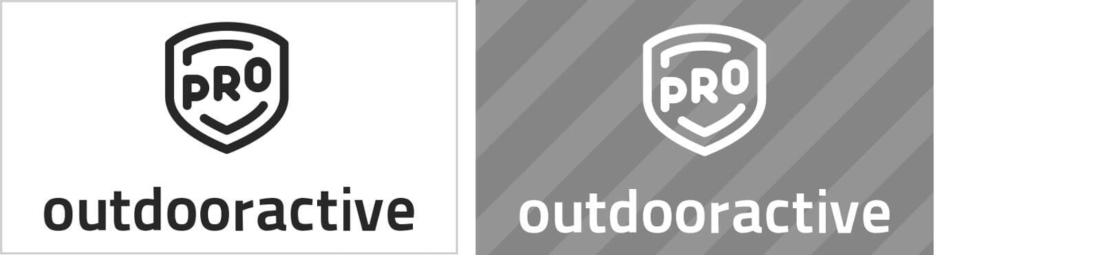
Pro and Pro+
Outdooractive
Pro
Outdooractive
Pro+


A "Marker" creates a visual connection to Outdooractive when there is insufficient space to use the default logo. For example, we place a marker in the bottom right corner of all videos.
The "Pro/Pro+" and "Outdooractive Pro/Pro+" logos are used exclusively in connection with Pro/Pro+ content. Ideally, the "Outdooractive Pro/Pro+" version should be used, as this provides better brand recognition.
Variations and Additions – Usage
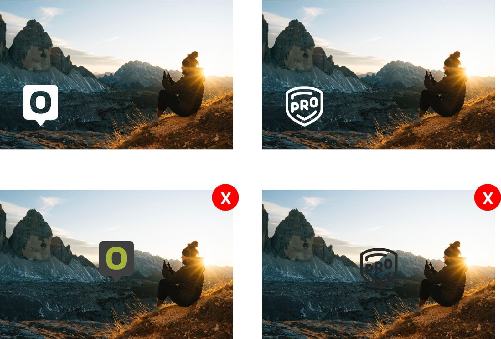
When using the marker and Pro/Pro+ logos, you should always use the version with the greatest contrast to the background so that the logo remains clearly visible.