Typographic Rules
Outdooractive
Outdooractive
outdooractive.com
Outdooractive Pro/Pro+
Outdooractive Pro and Pro+
Outdooractive Pro or Pro+
Source References

The first letter of the company name must always be upper case, i.e. "Outdooractive".
Never separate 'outdoor' and 'active'. There is only one spelling.
When referring to the web version of the platform, omit "www." and only write "outdooractive.com".
An image's source is always indicated on the right below the image. In certain cases it may also be displayed in #ffffff or #272727 at the bottom right of the image.
Always be certain to reference the "Source:." For example, if our map is integrated on an external page, you would type the following:
Source: outdooractive.com
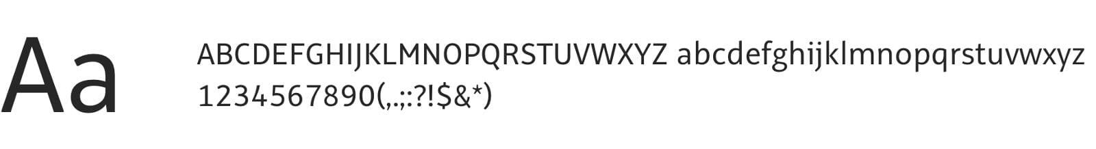
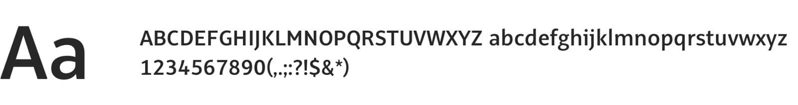
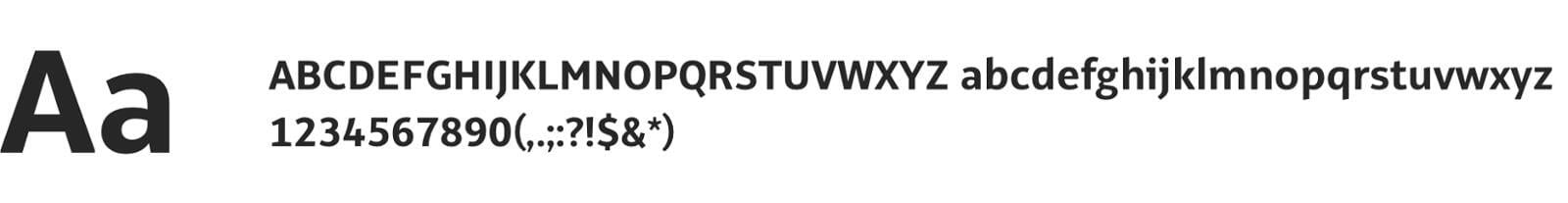
Font Faces
Alto normal
Alto semi bold
Alto bold
We never use italics or underline text!
Headings are always written in bold.