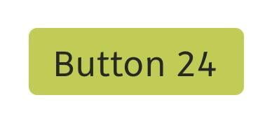
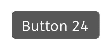
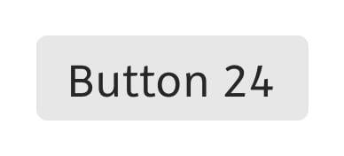
These are our standard buttons, they are used in B2C and B2B communication. You should always use the button color with the greatest contrast.
Custom, light and white buttons are labelled in #272727. Dark buttons are labelled using #ffffff.
Buttons – Sizes
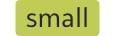
18px | 2px
14px normal
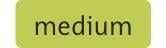
24px | 3px
14px normal
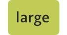
36px | 4px
16px semibold
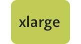
44px | 6px
16px semibold
On number on the left is the button height (in this case 18px) followed by the corner radius (2px). Below each buttons you can see the font size and style.
If the button width cannot be seen, the rule is that no more than 30 characters may be placed on a button.
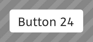
Pills on Images and Maps
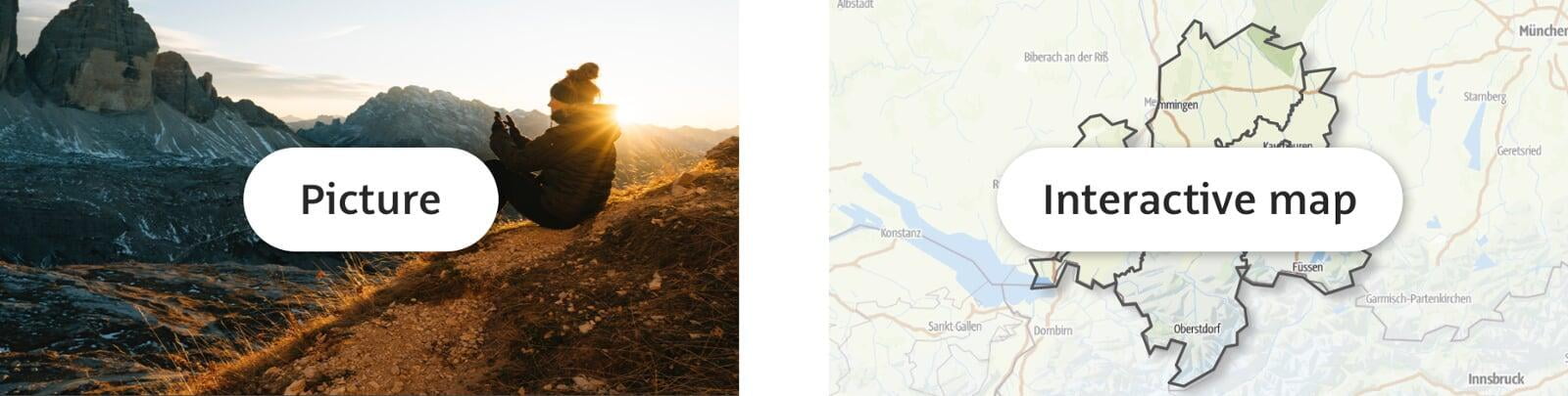
#ffffff Pills with #272727 text on them are what must be used for images or on the map.
A #272727 shadow with 40% opacity can also be created around the pill displayed on the map.